9 Genome-Wide Association Study
Now that you have learned how to perform QC, you can easily run a GWAS and execute some downstream visualization and analyses. Let’s do this with a dummy dataset.
9.1 Exploring the data
Even though someone says that the QC was done, it is still wise and good practice to run some of the commands above to get a ‘feeling’ about the data. So let’s do this.
First, we’ll clean up what we did before - we don’t need it anyways.
clear
rm -v dummy_project/*
With the command clear you create a blank Terminal screen. With rm -v you remove all files in the dummy_project directory, where the -v-flag means that you get a verbose output of what is removed.
plink --bfile ~/data/shared/gwas/gwa --freq --out dummy_project/gwaplink --bfile ~/data/shared/gwas/gwa --missing --out dummy_project/gwaplink --bfile ~/data/shared/gwas/gwa --hardy --out dummy_project/gwaLet’s visualize the results. First we should load in all the results.
Question: Load the data using R. [Hint: use and adapt the examples from the previous chapters.]
We can plot the per-stratum HWE p-values.
Question: Plot the per-stratum HWE p-values using R. [Hint: use and adapt the examples from the previous chapters.]
library("ggpubr")
ggpubr::gghistogram(gwas_HWE, x = "logP",
                    add = "mean",
                    add.params = list(color = "#595A5C", linetype = "dashed", size = 1),
                    rug = TRUE,
                    # color = "#1290D9", fill = "#1290D9",
                    color = "TEST", fill = "TEST",
                    palette = "lancet",
                    facet.by = "TEST",
                    bins = 50,
                    xlab = "HWE -log10(P)") +
  ggplot2::geom_vline(xintercept = 5, linetype = "dashed",
                      color = "#E55738", size = 1)
ggplot2::ggsave("data/dummy_project/gwas-hwe.png",
       plot = last_plot())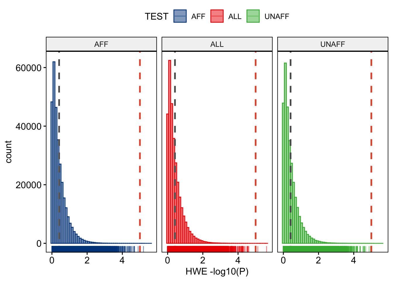
Figure 9.1: Per stratum HWE p-values.
We will want to see what the distribution of allele frequencies looks like.
Question: Plot the allele frequencies using R. [Hint: use and adapt the examples from the previous chapters.]
ggpubr::gghistogram(gwas_FRQ, x = "MAF",
                    add = "mean", add.params = list(color = "#595A5C", linetype = "dashed", size = 1),
                    rug = TRUE,
                    color = "#1290D9", fill = "#1290D9",
                    xlab = "minor allele frequency") +
  ggplot2::geom_vline(xintercept = 0.05, linetype = "dashed",
                      color = "#E55738", size = 1)
ggplot2::ggsave("data/dummy_project/gwas-freq.png",
       plot = last_plot())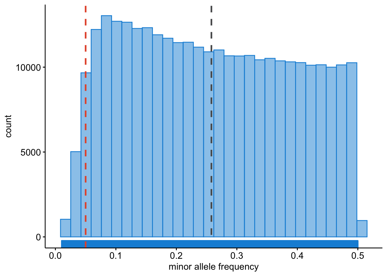
Figure 9.2: Minor allele frequencies.
We will want to identify samples that have poor call rates.
Question: Plot the per-sample call rates using R. [Hint: use and adapt the examples from the previous chapters.]
ggpubr::gghistogram(gwas_IMISS, x = "callrate",
                    add = "mean", add.params = list(color = "#595A5C", linetype = "dashed", size = 1),
                    rug = TRUE, bins = 50,
                    color = "#1290D9", fill = "#1290D9",
                    xlab = "per sample call rate") +
  ggplot2::geom_vline(xintercept = 0.95, linetype = "dashed",
                      color = "#E55738", size = 1)
ggplot2::ggsave("data/dummy_project/gwas-sample-call-rate.png",
       plot = last_plot())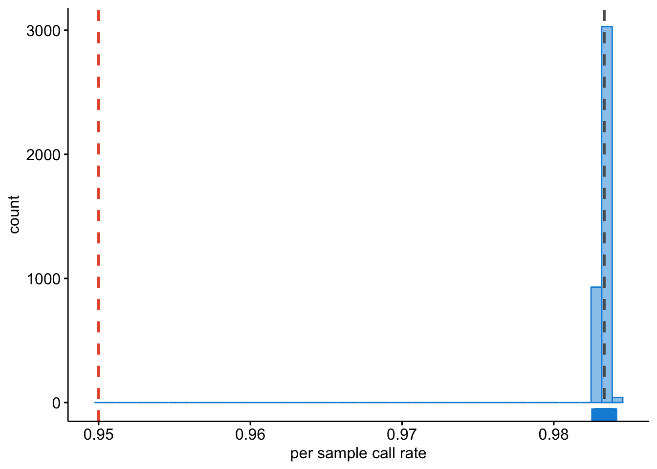
Figure 9.3: Per sample call rates.
We also need to know what the per SNP call rates are.
Question: Plot the per-SNP call rates using R. [Hint: use and adapt the examples from the previous chapters.]
ggpubr::gghistogram(gwas_LMISS, x = "callrate",
                    add = "mean", add.params = list(color = "#595A5C", linetype = "dashed", size = 1),
                    rug = TRUE, bins = 50,
                    color = "#1290D9", fill = "#1290D9",
                    xlab = "per SNP call rate") +
  ggplot2::geom_vline(xintercept = 0.95, linetype = "dashed",
                      color = "#E55738", size = 1)
ggplot2::ggsave("data/dummy_project/gwas-snp-call-rate.png",
       plot = last_plot())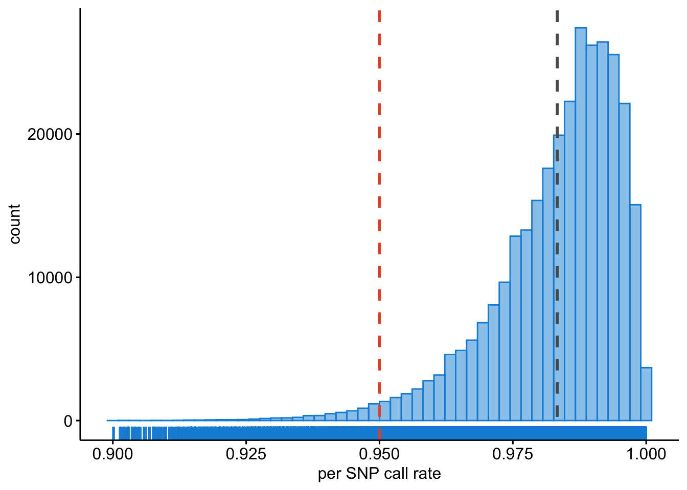
Figure 9.4: Per SNP call rates.
9.2 Genetic models
A simple chi-square test of association can be done.
plink --bfile ~/data/shared/gwas/gwa --model --out dummy_project/dataGenotypic, dominant and recessive tests will not be conducted if any one of the cells in the table of case-control by genotype counts contains less than five observations. This is because the chi-square approximation may not be reliable when cell counts are small. For SNPs with MAFs < 5%, a sample of more than 2,000 cases and controls would be required to meet this threshold and more than 50,000 would be required for SNPs with MAF < 1%.
You can change this default behaviour by adding the flag --cell, e.g., we could lower the threshold to 3.
plink --bfile ~/data/shared/gwas/gwa --model --cell 3 --out dummy_project/dataLet’s review the contents of the results.
gwas_model <- data.table::fread("dummy_project/data.model")

dim(gwas_model)

N_SNPS = length(gwas_model$SNP)

gwas_model[1:10, 1:10]
It contains 1,530,510 rows, one for each SNP, and each type of test (genotypic, trend, allelic, dominant, and recessive) and the following columns:
- chromosome [
CHR], - the SNP identifier [
SNP], - the minor allele [
A1] (remember,PLINKalways codes the A1-allele as the minor allele!), - the major allele [
A2], - the test performed [
TEST]:GENO(genotypic association);TREND(Cochran-Armitage trend);ALLELIC(allelic as- sociation);DOM(dominant model); andREC(recessive model)],
- the cell frequency counts for cases [
AFF], - the cell frequency counts for controls [
UNAFF], - the chi-square test statistic [
CHISQ], - the degrees of freedom for the test [
DF], - and the asymptotic P value [
P] of association.
Question: Do you know which model, i.e.
TESTis most commonly used and reported? And why is that, do think?
9.3 Logistic regression
We can also perform a test of association using logistic regression. In this case we might want to correct for covariates/confounding factors, for example age, sex, ancestral background, i.e. principal components, and other study specific covariates (e.g. hospital of inclusion, genotyping centre etc.). In that case each of these P values is adjusted for the effect of the covariates.
When running a regression analysis, be it linear or logistic, PLINK assumes a multiplicative model. By default, when at least one male and one female is present, sex (male = 1, female = 0) is automatically added as a covariate on X chromosome SNPs, and nowhere else. The sex flag causes it to be added everywhere, while no-x-sex excludes it.
plink --bfile ~/data/shared/gwas/gwa --logistic sex --covar ~/data/shared/gwas/gwa.covar --out dummy_project/dataLet’s examine the results.
## [1] 918306 9## CHR SNP BP A1 TEST NMISS OR STAT P
## <int> <char> <int> <char> <char> <int> <num> <num> <num>
## 1: 1 rs3934834 995669 T ADD 3818 1.0290 0.38120 0.7031
## 2: 1 rs3934834 995669 T AGE 3818 1.0020 1.11800 0.2635
## 3: 1 rs3934834 995669 T SEX 3818 1.0120 0.19090 0.8486
## 4: 1 rs3737728 1011278 A ADD 3982 1.0190 0.38670 0.6990
## 5: 1 rs3737728 1011278 A AGE 3982 1.0020 1.09800 0.2721
## 6: 1 rs3737728 1011278 A SEX 3982 1.0060 0.09898 0.9212
## 7: 1 rs6687776 1020428 T ADD 3915 0.9692 -0.33330 0.7389
## 8: 1 rs6687776 1020428 T AGE 3915 1.0020 1.04000 0.2984
## 9: 1 rs6687776 1020428 T SEX 3915 1.0150 0.23690 0.8127Question: How come there are more lines in this file than there are variants?
If no model option is specified, the first row for each SNP corresponds to results for a multiplicative test of association. The C >= 0 subsequent rows for each SNP correspond to separate tests of significance for each of the C covariates included in the regression model. We can remove the covariate-specific lines from the main report by adding the hide-covar flag.
The columns in the association results are:
- the chromosome [
CHR], - the SNP identifier [
SNP], - the base-pair location [
BP], - the minor allele [
A1], - the test performed [
TEST]: ADD (multiplicative model or genotypic model testing additivity),GENO_2DF(genotypic model),DOMDEV(genotypic model testing deviation from additivity),DOM(dominant model), orREC(recessive model)],
- the number of missing individuals included [
NMISS], - the
ORrelative to the A1, i.e. minor allele, - the coefficient z-statistic [
STAT], and - the asymptotic P-value [
P] of association.
We need to calculate the standard error and confidence interval from the z-statistic. We can modify the effect size (OR) to output the beta by adding the beta flag.
Question: Can you write down the mathematical relation between beta and OR?
9.4 Let’s get visual
Looking at numbers is important, but it won’t give you a perfect overview. We should turn to visualizing our results in Chapter 10.